[React] styleComponent 사용하여 나만의 Modal창 만들기
CSS in JS?
먼저 CSS in JS의 개념을 짚고 넘어가겠습니다. CSS in JS는 스타일 정의를 CSS 파일이 아닌 JavaScript로 작성된 컴포넌트에 바로 삽입하는 스타일 기법입니다.
기존에 웹사이트를 개발할 때는 HTML과 CSS, JavaScript는 각자 별도의 파일에 두는 것이 best practice로 여겨졌었습니다. 하지만 React나 Vue, Angular와 같은 모던 자바스크립트 라이브러리가 인기를 끌면서 웹 개발의 패러다임이 바뀌고 있습니다. 최근에는 웹 애플리케이션을 여러 개의 재활용이 가능한 빌딩 블록으로 분리하여 개발하는 컴포넌트 기반 개발 방법이 주류가 되고 있습니다.
패키지 설치
Styled Components는 styled-components라는 NPM 패키지명을 가지고 있습니다. 따라서 React 프로젝트에 다음과 같이 npm 커맨드로 간단히 설치할 수 있습니다.
$ npm i styled-components설치 후에 package.json에 styled-components가 추가된 것을 확인할 수 있습니다.
styled-components 의존성이 추가 된 것을 볼 수 있습니다.
기본 문법
- HTML 엘리먼트를 스타일링 할 때는 모든 알려진 HTML 태그에 대해서 이미 속성이 정의되어 있기 때문에 해당 태그명의 속성에 접근합니다.
import styled from "styled-components";

styled.button`
  // <button> HTML 엘리먼트에 대한 스타일 정의
`;- React 컴포넌트를 스타일링 할 때는 해당 컴포넌트를 임포트 후 인자로 해당 컴포넌트를 넘기면 됩니다.
import styled from "styled-components";
import Button from "./Button";

styled(Button)`
  // <Button> React 컴포넌트에 스타일 정의
`;
두가지 문법 모두 ES6의 Tagged Template Literals을 사용해서 스타일을 정의합니다. 그리고 styled 함수는 결국 해당 스타일이 적용된 HTML 엘리먼트나 React 컴포넌트를 리턴합니다.
Button스타일링
import React from "react";
import styled from "styled-components";

const CustomButton = styled.button`
  background-color: ${props => props.background || "#4000c7"};
  color: ${props => props.color || "white"};
  margin-bottom: ${props => (props.marginbottom || '0px')};
  border: none;
  padding: 10px 20px;
  border-radius: 5px;
  cursor: pointer;


`;

export default function Button({children, color, background, onClick, marginbottom}) {

    const handleClick = () => {
      if(onClick) {
        onClick()
      }
    }
    return (
      <CustomButton color={color} background={background} onClick={handleClick}  marginbottom={marginbottom}>
        {children}
      </CustomButton>
    );
}
background , color, marginbottom을 버튼두는 곳에 따라 색상 및 위치 변경을 위해, 속성을 통해 각각 배경색을 지정해주기 위해 이렇게 코드를 짰습니다. 이렇게 하면 버튼의 재사용성을 더 높일 수 있습니다
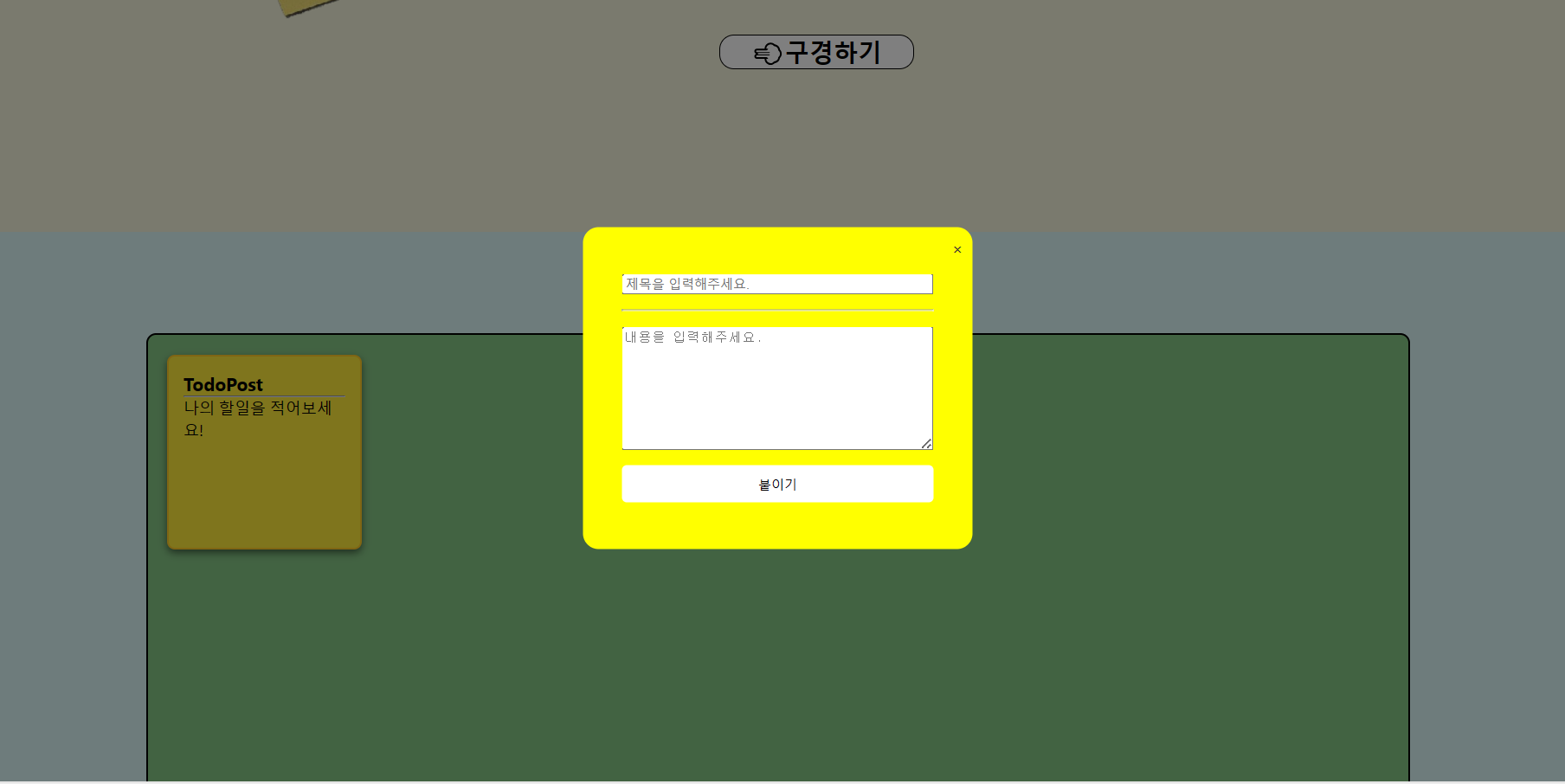
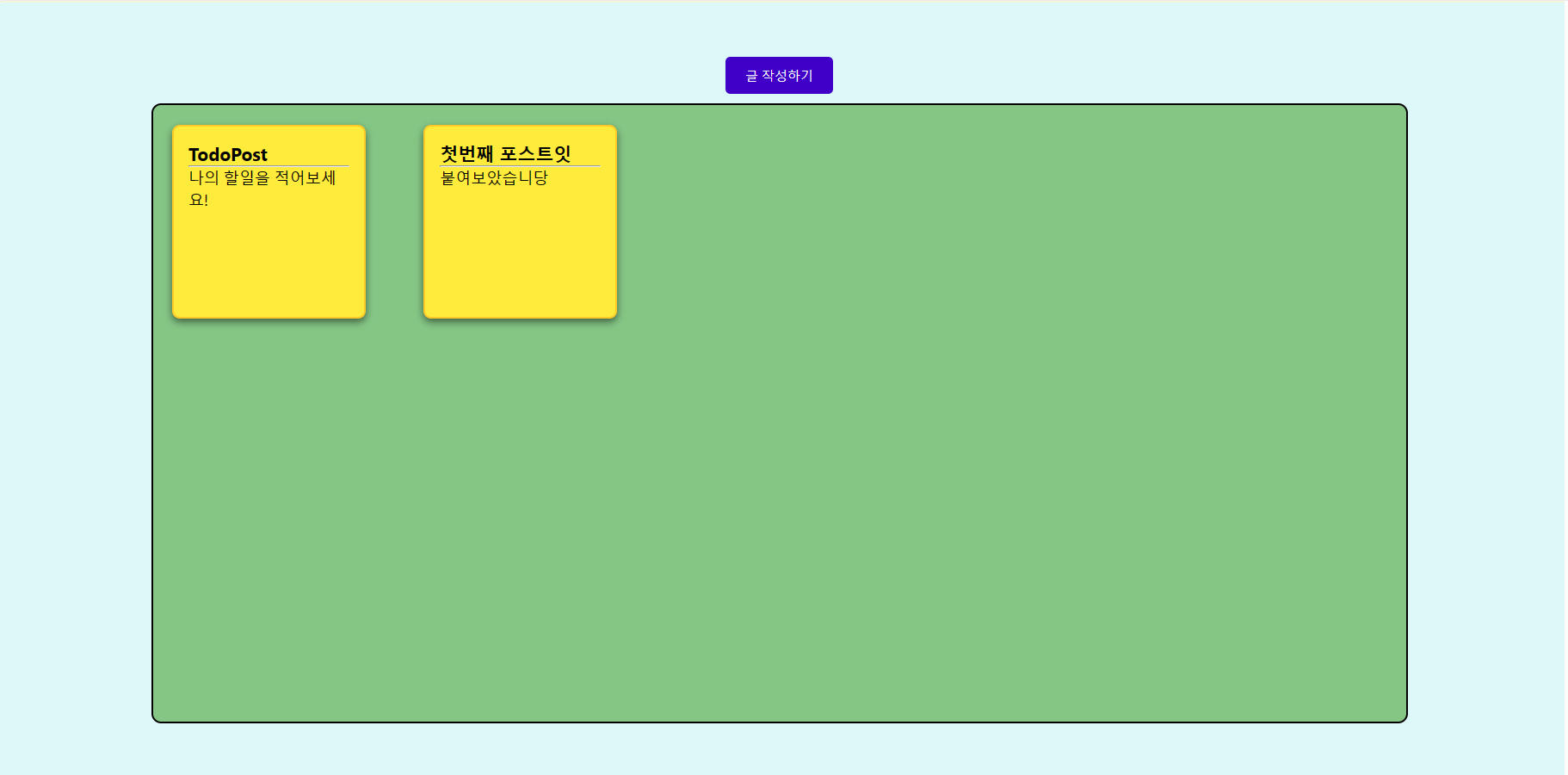
모달창 제작
import React, { useState } from 'react';
import styled from 'styled-components';
import Button from '../Styles/Button';

// 모달 창을 스타일링한 컴포넌트
const ModalContainer = styled.div`
  display: flex;
  justify-content: center;
  align-items: center;
  position: fixed;
  top: 50%;
  left: 50%;
  transform: translate(-50%, -50%);
  border: 1px solid lightgray;
  border-radius: 20px;
  padding: 20px;
  background-color: white;
`;


const ModalBackdrop = styled.div`
  background-color: rgba(0, 0, 0, 0.5);
  width: 100vw;
  height: 100vh;
  position: fixed;
  top: 0;
  left: 0;
  display: flex;
  justify-content: center;
  align-items: center;
`;

const ModalView = styled.div.attrs(() => ({
  role: "dialog"
}))`
  display: flex;
  padding: 40px;
  flex-direction:column;
  justify-content:space-around;
  position: fixed;
  width: 400px;
  height: 330px;
  border-radius: 1rem;
  background-color: yellow;
  > .close-btn {
    position: absolute;
    top: 10px;
    right: 10px;
    cursor: pointer;
    color: #333;
  }
`;

const Modal = ({onClose, onSave}) => {

  const [ title, setTitle] = useState('');
  const [ content, setContent] = useState('');

  const changeHandler = (e) => {
    if (e.target.className === 'title') {
        setTitle(e.target.value);
    } else {
        setContent(e.target.value);
    }
  };

  const handleSave = () => {
    // onSave 콜백 함수를 호출하여 title과 content를 부모 컴포넌트로 전달
    onSave({ title, content });
    // 모달 닫기
    onClose();
  };

  return (
    <ModalBackdrop>
      <ModalContainer>
        <ModalView>
            <div className="close-btn" onClick={onClose}>×</div>

            <input
            className='title'
            type='text'
            placeholder='제목을 입력해주세요.'
            value={title}
            onChange={changeHandler}
            />

            <hr></hr>

            <textarea
            placeholder='내용을 입력해주세요.'
            rows="8"
            cols="30"
            value={content}
            onChange={changeHandler}
            />

            <Button color='black' background='white' onClick={handleSave}>붙이기</Button>
        </ModalView>
      </ModalContainer>
    </ModalBackdrop>
  );
};

export default Modal;
Modal 부분에서 Button에 color='black' , background='white'로 설정하였습니다.
결과